Website design, the formal process of planning, designing and building electronic files which govern the use of graphics, fonts, colors, layout and specific interactive features to deliver pages to website visitors through a web browser, doesn’t have to be as complicated as some people make it out to be.
Designing these pages and posting them on the internet for the world to see is something businesses invest heavily in. If you are not already focusing on a great business web page design, here are some statistics to help change your mind:
When folks have approximately 15 minutes to digest web page content, 2/3 of them prefer reading something that boasts a beautiful, aesthetic design than something with plain images and text only.
- 38% people stop engagement on a site if they find the layout unappealing.
- After arriving on a web page through a referral site, 36% visitors click on the company logo to reach the home page.
- 80% internet users own a smartphone, which makes good web page design all the more important for businesses of all calibers.
Why Website Design is So Important for All Businesses
Try this simple test if you will: think of something you’re interested in searching on the internet. Take one look at Google results and click on the link which looks like it has the answers you need. When you arrive on that page, did it take you long to find what you wanted? Was it a breeze or more of a chore to find what you needed? Did the site navigation make it easy to go from one section to the next?
If you were able to find the desired information easily and quickly, the website or page you just visited was designed well and easily navigable, primarily with user-friendliness or usability in mind. Web page usability is something that’s often overlooked while designing business web pages. Here are some statistics on what makes one aspect of designing web pages, user design, so pivotal:
- 47% visitors will go straight to a business’s products and services page before checking out other sections.
- When visitors arrive at a company’s home page through a referral site, 50% use the navigation menu to find their way around.
- After arriving on the homepage, 64% visitors want to see the business’s contact information.
Therefore, paying attention to your company web page design is something that should be getting a lot of attention as visitors need to easily and quickly find what they want – that’s why they arrived at your page in the first place. If they find it unattractive or difficult to navigate, they will simply go to another site. That’s opportunity lost, not to mention potential for revenue.
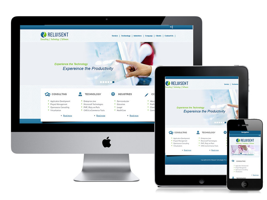
Responsive Web Design vs. Mobile-first Web Design
Responsive web design essentially revolves around a multitude of screen sizes, so that a single site can accommodate tablets, laptops, desktop PCs and smartphones. Display parameters adjust accordingly while keeping a single content source and URL in the picture.
From a more technical standpoint, it involves the use of a single HTML code which is self-adapting in nature so that varied screen sizes can be accommodated by way of CSS media queries.
A mobile-first design, as the name implies, gives priority to how pages are displayed on mobile devices. Website design and coding is geared towards smaller screens, while design for bigger screens, including desktop PCs, is somewhat of an afterthought.
This approach is also called progressive enhancement. Another key attribute is the focus on a ‘clean’ design since it has to display properly on a smartphone screen. When the mobile design is ready, it can be easily transferred to PC and other display devices, not the other way around, as it can be complicated.
In the case of mobile-first design, different HTML codes are used for respective devices, while two URLs are used, as opposed to the former.
Which One Should I Go With?
The answer to this pretty much depends on what your business goals are. Your company might want to have a responsive web page design that displays great on desktop PCs, including larger portable devices as well as iOS and Android phones. Or you might want to focus on a mobile-first design only in case your business requires users to have a smartphone or avail services through the same only. Other factors may include the scope and scale of your projects or what budgets you have allocated to each.
Good to Know
- 60% users access the internet on mobile devices
- 34% smartphone users prefer to go online using their phones as opposed to desktop PCs or other devices
- 40% people go with another web page if they discover the page is not mobile friendly
- 45% users between the ages of 18 and 29 use their smartphone to look stuff up on the internet
People are looking for web pages that quite simply give them quick access to the information they want, in an easy-to-read and visually compelling way. Get in touch with us for a FREE consultation by dialing 1.888.566.2577 and see how we bring your web pages alive.
Common Elements of Web Design
A great web design is always easily readable and navigable, helping visitors finding what they need and bringing you a step closer to signing them up.
Here are some of the most common components that go into web page design:
Layout
This is where you decide how graphics, textual content and ads are displayed. A key thing to remember is that it all needs to be arranged in a way for the user to easily find everything at a glance. So, a certain balance has to be maintained while keeping design consistency and integrity high.
Color
How you’re going to use colors largely depends on what the business does and who it caters to. You might be inclined to use a classic layout with black and white and retro colors or a more multi-colored design approach, which conveys the vision of the person behind the brand. There is a lot of room for experimentation, though eventually it comes down to how you want to project your brand.
Graphics
This includes photos, icons, logos and all non-textual design elements used to improve the look or layout of your web pages. For the most usability or user-friendliness, all these elements need to placed strategically, while appropriately tying in with color usage and web page content. Make sure that it doesn’t look too cluttered or generally slow to load.
Fonts
How you use fonts can really add a lot of dimension and depth to the look of your pages. Keep in mind though, that many web browsers are capable of reading certain fonts only, often called “web-safe fonts”, so it’s a good idea to have your designer work within the confines of commonly used or known fonts.
Navigation
Aspects like menus, architecture and other navigation tools in the web design process need to be taken into account as users like to search and browse websites a certain way; the main idea is to have users move from page to page on the site with complete ease and efficiency.
Compatibility
Web pages need to be designed in a way to get them performing optimally on all common browsers and operating systems, including mobile and nonmobile devices, so that your pages get the most views no matter how users prefer to find them.
Technology
Keeping a check on technological advancements is a common component of good web design, as it gives you the freedom to innovate while improving navigation and usability, among other things. This way, your website design always looks fresh and inviting, as well as dynamic and highly responsive.
Page-building and Design Platforms
CSS and HTML are two common technologies used to build web pages. CSS is used for style, fonts and layout, while HTML is used for structure.
Some of the best website builders include BigCommerce, which is scaled to suit your needs when you want to open an online store; WebFlow, which lets you create sites across several devices, and; Builderengine, which allows you to create large websites on the cloud. If you’re looking to start off with ready-made design templates before getting down to the specifics, you can check out website themes by WordPress. However, the best is to get a customized design, and AOK Marketing can help you in this regard. Give us a call at 1.888.566.2577 to speak to one of our representatives.
Case Study: Website Design Done Right
Offpsring, a leader in the UK fashion sportswear and sneaker niche, did not have a mobile-friendly website at first. Users were naturally not happy about being unable to access their favorite fashion sportswear distributor through mobile devices, which lead to a decline in conversion rate and revenue.
It became blatantly clear that in order to stay in sync with current digital design trends and consumer demand, a migration to responsive web design was in order.
This meant having a mobile-dedicated website. Offspring went for a responsive web design which saw automatic re-formatting and resizing according to what kind of mobile device was being used to access their site.
The aim was to redesign pages to reduce the tendency to “pinch and zoom in” on products. Since mobile-friendliness is a common factor that is used to gauge online website rankings on Google and other search engines, the company’s efforts really paid off.
The online UK retailer also wanted to see to it that tablet owners get a bespoke experience when accessing their pages. This paid off as well and they saw a 20.35% increase in e-commerce conversion rate from tablet users.
At the end of the day, they were able to improve customer experience across all devices, boost conversion rates and generate more revenue.
Making Web Design a Complete Success: Best Practices
1. The Importance of UI/UX Integration
Before getting down to interface design, understand this: user interface is directly tied to user experience, though the latter has a significantly larger scope.
While UI is what makes or breaks a website, designers must consider factors like interaction design and flow, copywriting, creating clear taxonomies, communicating it all to programmers and designers etc. It’s this overall design process that makes a web page design memorable from top to bottom.
UI designers must look at it from a UX perspective; what problems need solving, what user flow to implement and deciding on the main product ideas as well as hierarchies. Once this information is at hand, proper work on the interface can be kick-started, during which mockups are made, extensively tested and eventually approved by UX architects.
2. Understand Your Online Visitor
Before even contemplating the launch of your website, you need to gain important insights into who your average visitor is. What will attract them to your website? How can you work on your design to draw them in all the way? Check out top websites in your niche; how do they attract visitors by the thousands or millions?
Take a look at the colors and layouts that work best. Are they sticking to the same styles throughout, or does it vary according to web user demographics? Determine what design patterns their users are comfortable with and while you can certainly “ease” a few ideas into your own pages, you should create a design that is completely fresh and unique.
Identify your audience and get on with the A/B testing.
3. Less is More: Keep it Simple and Consistent
What makes many of the top website interfaces so inspirational? Simplicity complemented by consistency all throughout.
This is not to say you will have a colorless page with 3-4 tabs and 2 lines of copywriting. What it means is an interface that is 100% readable, easy to understand and leads to quick, decisive actions. Users should not feel the need to rely on a map to smoothly navigate between sections on your site; your interface designer should take this into account and work on making the design flow seamlessly from page to page.
To accomplish this, focus on some key elements like typography, colors and visual hierarchies that heavily come into play; these have been discussed in more detail later down this section. Put yourself in your user’s shoes for a moment: have you gone with jarring stylistic design choices that prove more frustrating than convenient? Is there a level of consistency and progressive flow between pages? Are you having to create a really complex map in your head or going between pages 1-4 and back is as easy as cake?
Communicate this clearly to your interface designer.
4. Highlighting Key Elements
Key elements of your interface need to stand out and the most direct way to achieve this is to make certain elements bigger in order to draw more attention to them.
A more novel approach is to judicially use white space for highlighting crucial parts or CTA’s in your interface.
By simply introducing an element in your design that catches your visitor by surprise but tastefully, you can get very positive results. Since you’re practicing a high level of consistency throughout, even to the point it gets repetitive, a change of pace in a fun and surprising way is something users will welcome.
5. Clever Typography
Establish the right visual hierarchy in your web pages by elegantly tying in typography. However, there’s more to it than simply going with a nice font and using it all over your web pages (spoiler: designers can’t get enough of Comic Sans).
Look at it this way: every font speaks to the audience in a distinct, personalized way and should be used to that effect.
Size is one major aspect you’ll be considering when selecting fonts. Headers need to be bigger, naturally, along with sub-headings and/or subtitles. However, use it liberally, as you also want audiences to focus on the meat of the content, which is what’s under those headers and subheadings.
Want to make your text stand out more? Use reverse type – using contrasting backgrounds in order to make that text pop. I.e. contrasting text can be used in one of your menus to highlight the page number being currently viewed. You’re also making navigation smoother, by the way.
6. Use Color and Contrast to Good Effect
There’s a complete science behind choosing the right colors, which play an integral role in conveying visual hierarchy of your pages and establishing meaningful relationships between other visual elements.
While designing your interface, maintain uniformity because you’ll be using specific colors to relay visual cues. Also, keep you color scheme relatively low, as we are not inviting visitors to check out the new children’s color book on the block.
Being said, contrasting colors work great to draw attention and a key thing to remember is that darker color tones boast more “visual weight”. These darker tones need to be balanced out with lighter colors. How you make use of these contrasting tones depends a lot on what type of product you’re offering, the company logo and brand vision.
7. Collaborate!
You’re most likely not shouldering all the responsibility of creating the company web pages. At some point you’re going to ask the creative muscle in your team to lend you their feedback and it is imperative that every team member is on the same page.
What the Crystal Balls Says about Web Designing
Changes to website design practices are evolving at a lightning pace, as we speak.
The US Bureau of Labor Statistics claim web design-based employment is set to grow by 27% up until 2024, which is a lot faster compared to other occupations. This demand will soar further given the popularity of mobile devices and ecommerce platforms.
Simply put, you need to get your web design in order if you want visitors to choose your brand over you competitors.
The AOK Competitive Edge
The pointers discussed in this piece shed light on key components at a basic level, just to give a gist of things. Great web design is a very involved and highly technical field that requires sound judgment and design skills that might leave even Giorgio Armani green.
The AOK Marketing advantage incorporates some of the most cutting edge tools to craft your web pages. Check out how we’ve really turned around the appearance of some of our clients’ websites.
No matter what your business goals are, we just want your web users to easily and quickly find what they want and head over to the shopping cart, while being drawn in by a mesmerizing and unforgettable website design. Contact us directly or call us on our toll-free number for a FREE consultation: 1.888.566.2577.
About The Author


