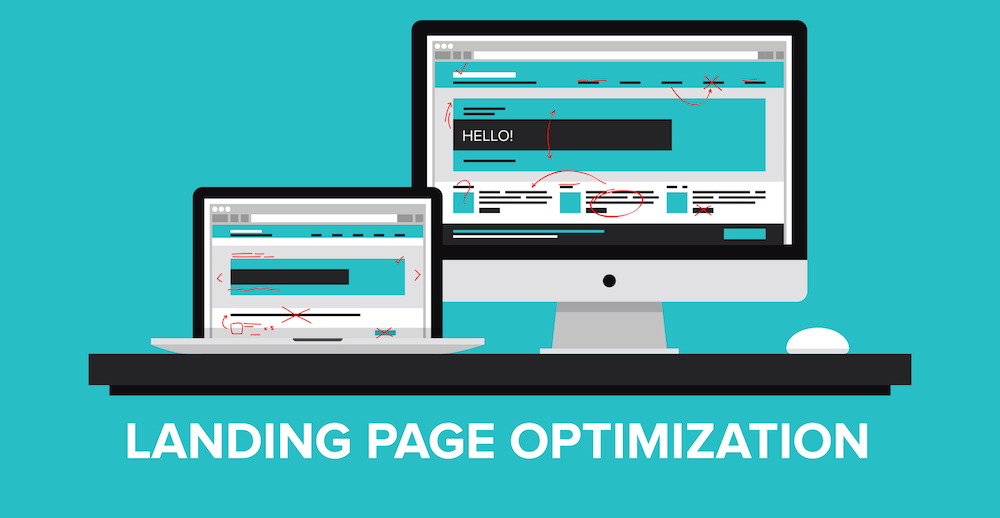
A landing page is the first direct interaction between a prospect and your business. Ads and promotional campaigns direct interested customers towards dedicated landing pages. It is the perfect opportunity to turn a prospect into a definite lead. You can only convert successfully if you have crafted a great landing page. Landing pages may look simple but there is a purpose behind every choice. From the size of the text to the color of the buttons, each element must be designed, tested and tweaked to improve your landing page.
This guide will help you optimize your landing page. It is quite detailed and serves as a 360 degree view tutorial. Read on to discover the eleven best practices you should follow.
Transform your Hero Shot into a Superhero Shot
The hero shot is the focal point of your landing page. It needs to clearly depict the benefits of your product. Avoid using the clichéd stock image of a guy dressed in a business suit interacting with some generic tech device. Your landing page should not involve the visitor in a guessing game.
The quality of the image/video speaks volumes about your brand. A professionally shot image will convey integrity and trustworthiness. A poorly chosen stock image on the other hand will end up confusing the visitor and drives down the conversion rate.
Here are the criteria you should use during selection:
- Impact/Influence—what does it say to the customer?
- Relevance—is the product clearly depicted?
- Education—does the image provide information?
- Context—does it work well with the overall product?
- Emotion—can it evoke an emotional response?
- Persuasion—is it good enough to convert?
Reduce Visual Clutter
Reducing the visual complexity of the page will make the landing page look more seamless and polished. The overall comprehension will improve and conversion rates will rise.
Do not include flashy and pulsating elements. The visual design of the individual elements should give a clear indication of their purpose. A button that looks clickable (using 3D shadows or similar effects) clearly communicates that it is meant to be clicked. A flat rectangle with some text just looks like another design element.
Your basic layout should be symmetric and structured. Asymmetric layouts look messy and unprofessional. Your visitors will find it hard to understand and lose interest almost immediately.
Pay Attention to Attention
Capturing attention is your biggest challenge when it comes to optimizing a landing page. You prospect is a fickle creature with a limited attention span. There are three basic aspects of how attention intersects with your ad copy:
- Ad or post headline—Capture attention by stating a benefit and making a promise
- Landing page headline—Maintain the attention by reiterating the promise
- Landing page design—Holding and focusing the attention to convert
Optimize Landing Page Attention Ratio
Attention is a limited cognitive resource. This is one area of landing page optimization where the “less is more” principle fits perfectly. If a landing page contains a ton of options, CTA’s, and the kitchen sink, your design needs a serious overhaul.
Those options end up confusing your prospect. Confused visitors get distracted and simply leave. A surefire way to maximize conversions is to optimize the attention ratio.
The attention ratio compares the number of possible actions the visitor can make and the number of actions that the visitor should do.
Attention Ratio—Possible Actions: Ideal Actions
From a cognitive behavioral perspective the ideal attention ratio is 1:1. That is the landing page should have one clearly marked action which you want the user to perform. Don’t throw in too many choices in the mix. Remove any unnecessary links, verbose information panels, and other distracting elements.
Fix the Information Hierarchy
The information hierarchy is the order in which information is presented on a landing page. Visual cues such as contrast, size and position of the text affect the perceived hierarchy. Here are the design principles which affect hierarchy:
- Size—the biggest element/text will be the one most noticeable
- Contrast—Color doesn’t affect CTA’s, it’s the level of contrast which matters. Your CTA should stand out.
- Symmetry—helps bring focus to one part of the page
- Similarity (of color, size, shape and proximity)—highly similar things tend to be perceived as related
- Grouping/Encapsulation—draws attention to a set of related elements by encapsulating them together
- Style—changing the style of one element will make it stand out
- Color—Different colors are associated with different emotions
The Importance of Whitespace
Your landing page is not The Million Dollar Homepage. Don’t fill it up with irrelevant elements. Make clever use of whitespace to draw the reader’s attention to where you want. Space makes the composition of the design look simpler and focused. Any element surrounded by space will draw in the eye because it stands out.
Take advantage of these to control where the attention of the reader moves. Bring their attention to the most relevant message first, and then use smooth transitions to guide them towards the action you want performed.
Include Social Proof
Social proof uses social signals to communicate the fact that a large number of people have bought and used your product or service. It lets potential customers know that the product has been vetted by others with similar needs.
Displaying social proof indicates how popular your product is. It is common sense that people will only buy products which are best at fulfilling a need/desire. The application of this simple principle in terms of landing page design is to offer social proof. People are more likely to convert if they know that others have done the same and benefited.
There are two basic types of social proof:
1) Quantitative
- The number of people who have availed the offer
- Number of social media likes, tweets, retweets, etc.
- Total downloads
2) Qualitative:
- Customer testimonials
- Positive reviews by industry influencers
- Celebrity endorsement (unpaid)
- Awards from reputable organizations
- Certification by a standards body
- Customer reviews
Most websites however use customer testimonials. The rules you should follow is to highlight a key phrase if the original text is too long. The testimonials you use should be ideally highlight the benefits of your product. IT should contain details, not vague statements such as “This is a great product” or “Amazing service”, you get the gist.
Try finding one which states the issue faced by the customer and how your product helped solve it. Reach out to repeat buyers and ask them why they like your product/service.
Clearly State the Product Benefits
Craft an effective headline which states the benefits of your offer. If you go into details of features, make sure you use properly indented text. Bullets will help break up long lists into readable copy. Users will be able to skim through the main list elements and can read the detailed features of the ones they are interested in.
These benefits should be direct and concise. It should communicate the uniqueness of your offer. Use a unique value proposition.
Get the Call to Action Right
The call-to-action drives your conversion rate. Get it right and you probably accomplished 80% of your goal. There are a couple of things you need to keep in mind in order to design an effective CTA.
Placement
Place the CTA next to the problem or question you are asking in the headline. This tells the customer that the solution to the problem is within easy reach. For more information-dense landing pages, such as list of features, always place the CTA above the fold. For pages with less copy you can place the CTA below the fold and still retain attention.
Contrast
Make the button stand out by using contrasting colors. But make sure these colors don’t clash; neon pink on blazing yellow is quite frankly, horrible to look at. Choose a color that makes it stand out but also works with the rest of the colors on the page.
Clickability
Use 3D effects or shadows to make the button look clickable. The visitor will mistake it for just another design element if it is too flat or blends in with the background. Don’t overdo the 3D effects, the MySpace look is not the target here. A subtle effect is enough. Another trick is to add a rollover state, which changes the color or shadows when the user hovers over the CTA.
Size
Make it big enough to stand out but not so big that it threatens to swallow up your copy.
Directional Cues
Pointing to the CTA will both inform and guide the prospect towards action. Describe the benefit of clicking on the button and display it below or above the CTA button. Link the benefit with the CTA by providing directional cues.
Urgency
An element of urgency can boost the number of clicks. Apply a quantity or time limitation to the offer. Reiterate the limit by placing words such as “Today!”, “Now!” near the CTA.
White space
Reduce the clutter around the CTA. It should be surrounded by whitespace in order to be noticed.
Purpose
Place information regarding the purpose of the form at the top of the form fields. The visitor should know exactly why they are providing their information.
Clarity of Language
Do not use technical jargon obscure acronyms in the ad copy. Do not make any assumption about the target audience. Make sure your copy appeals to a wider audience. Do not limit your appeal by using unclear language.
Resolve Readability Issues
The copy of the landing page should flow smoothly. Even if you have gotten the language clear as a bell, readability issues can have a negative impact. Make sure the text is properly aligned, this is especially important if you are redirecting mobile-traffic to the landing page. Screen sizes vary drastically amongst devices, test all the text and images to be sure they look right. Fix any overlapping elements, awkward line breaks in text and paragraph spacing. Your choice of font also affects readability, choose crisp well-formed fonts. Do not choose a narrow font or your readers will be squinting to make out your message.
These eleven basic rules will help you optimize the conversion rate of your landing page. This guide will be a great help for those of you who wish to follow best practices and learn optimization techniques. Keep in mind though; this is by no means an exhaustive guide. Over half of these points probably deserve a dedicated blog post. If that is something you would be interested in, let us know and we will create a dive into the details and share our learning process.